Travel in Patterns | TF Concept
This afternoon, we approach the sphere of music, taking a look at how electronic beats get reflected into pure geometrical constructions. There is definitely a strong connection between sound and graphic patterns but, from there, designer Tânia Filipa Silvestre, from Lisbon, Portugal, turned this connection into a highly personal approach.


The visual project of the TF Concept started in 2013 and now counts collaborations with the whole world, be it with startup labels from Canada or big brands from the U.K. Music events or releases on digital or analog media are illustrated with minimal graphic gestures, using basic geometrical shapes that are, then, multiplied, added, distorted or turned into fantastic, yet purely abstract, spatial shapes. Dots, lines, circles, triangles or squares are always a part of this process that emphasizes on the beauty of simplicity, this being what the designer stands for.

From her already extensive portfolio, the designer chose three artworks to be detailed in her own words.
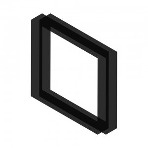
Opium Rooms / Flyer for Abstract / Ireland
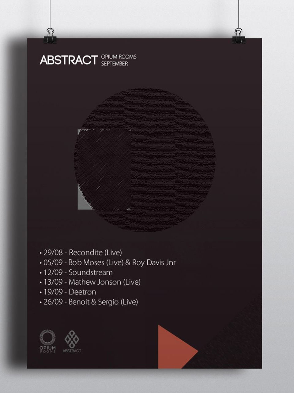 I’m starting with this one because i tis really special at a personal level. I think it was one of the first projects I did. It was later used for one flyer for Abstract, a project connected to electronic music from Dublin, Ireland.
At the time I was just designing for myself, no deadlines, no clients to satisfy, and I was experimenting with lots of textures, and how they could interconnect but still be one. It is one of my favorites also because it is very simple, and it is what I have always wanted to prove that simple is, always, more beautiful. That you can withdraw so much to your inner self from a simple image. In terms of colors, I love pastel colors, and everything fitted here perfectly, as the goal always is to try to achieve harmony between design, text and background.
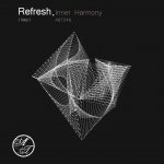
Solo-Man EP / Digital Cover for Soloman Forest Records / Canada
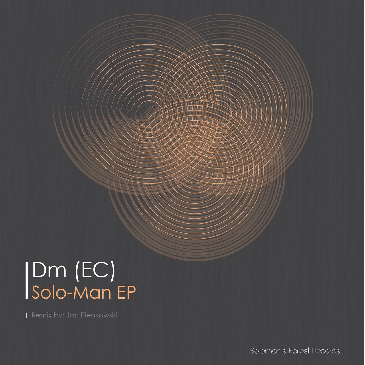
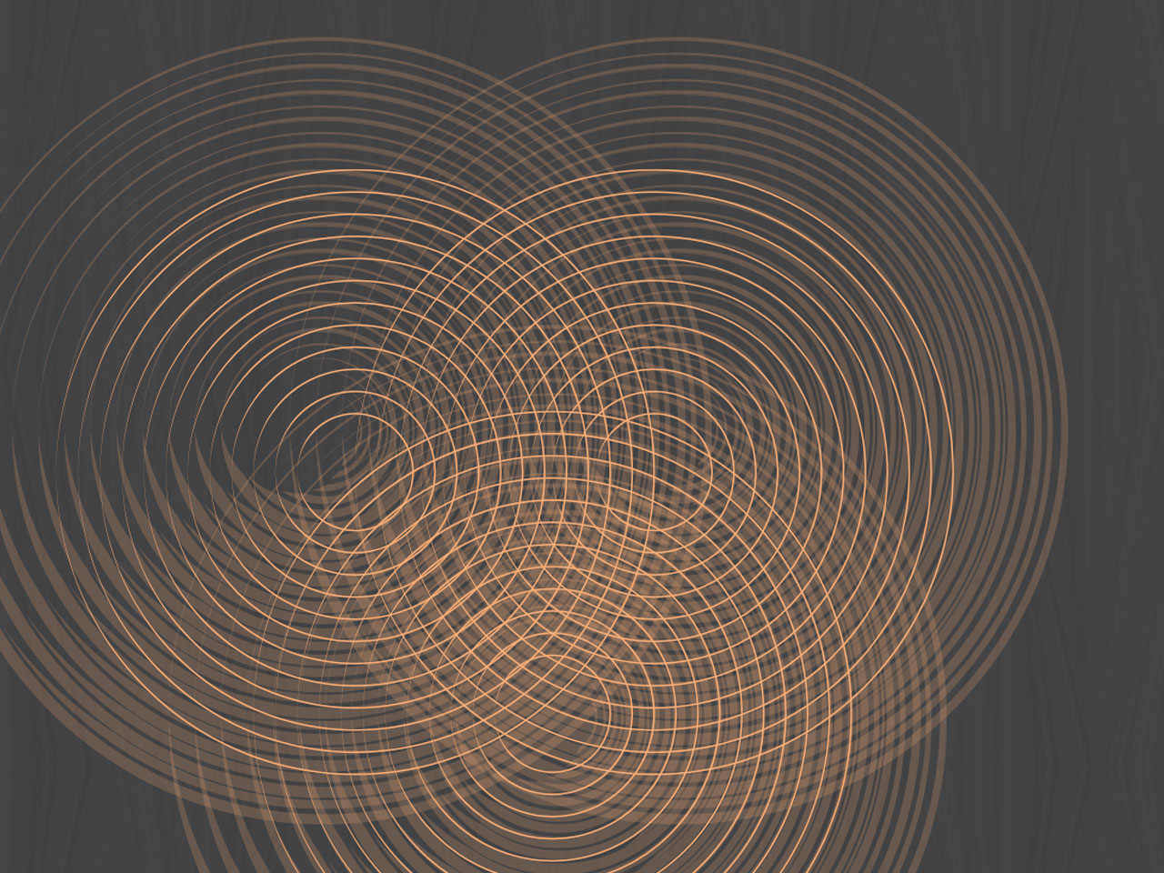
This one is also a mark in my professional project. It was the first cover I did for Soloman’s Forest Records, an electronic music label that is based in Montreal, Canada. I have been working with them for 2 years now and the freedom to design that they give me is perfect. I really feel that I can explore everything that I have to offer when it comes to geometric and minimal design with them, it’s very important to know that people do embrace and appreciate your vision. The idea behind this one was to keep it simple yet messy: I created multiple layers with blend circles with different virtual “brushes” and started to distort them. The background is one of my favorite colors, grey, with a very simple lined pattern with transparency, just to give a special touch.
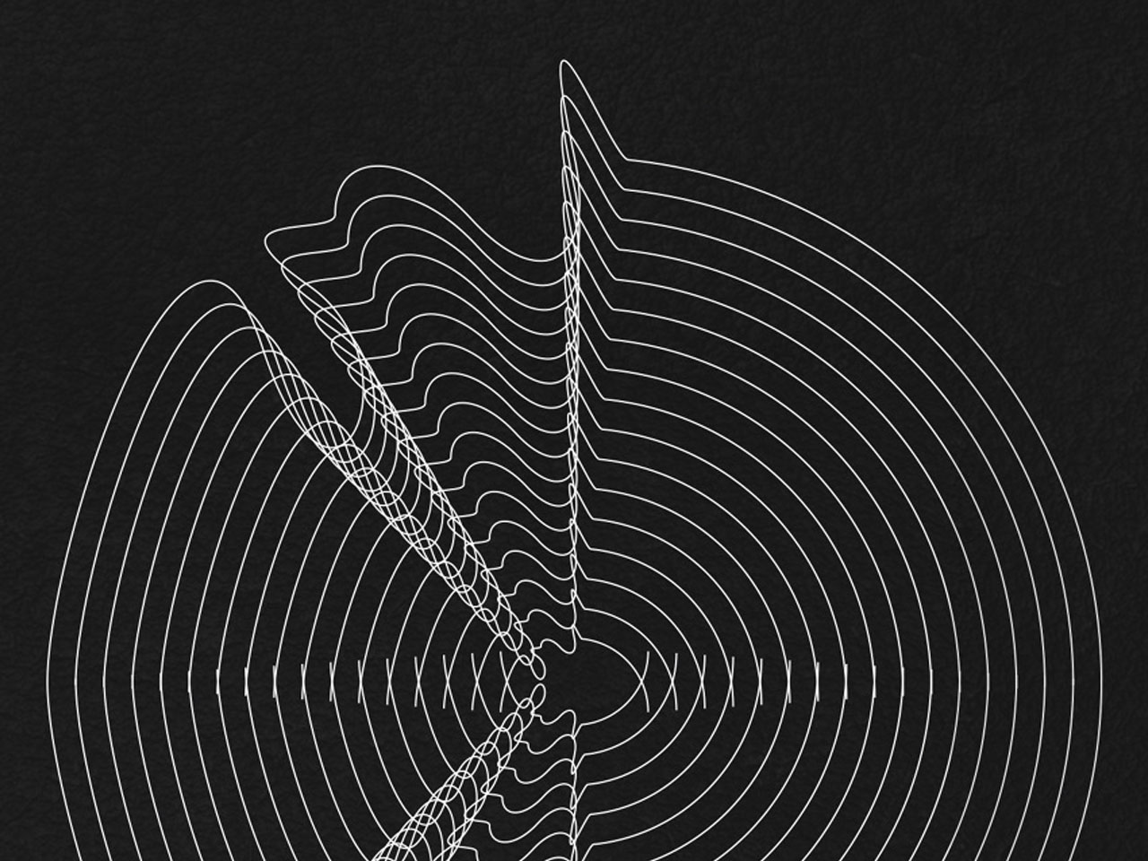
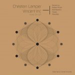
Tau / Vinyl Cover for Francesco Bonora / Italy
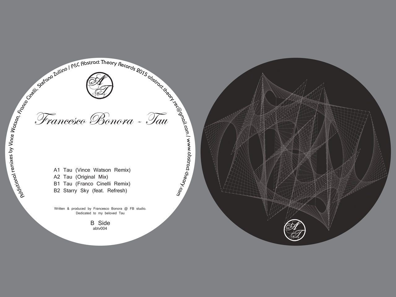
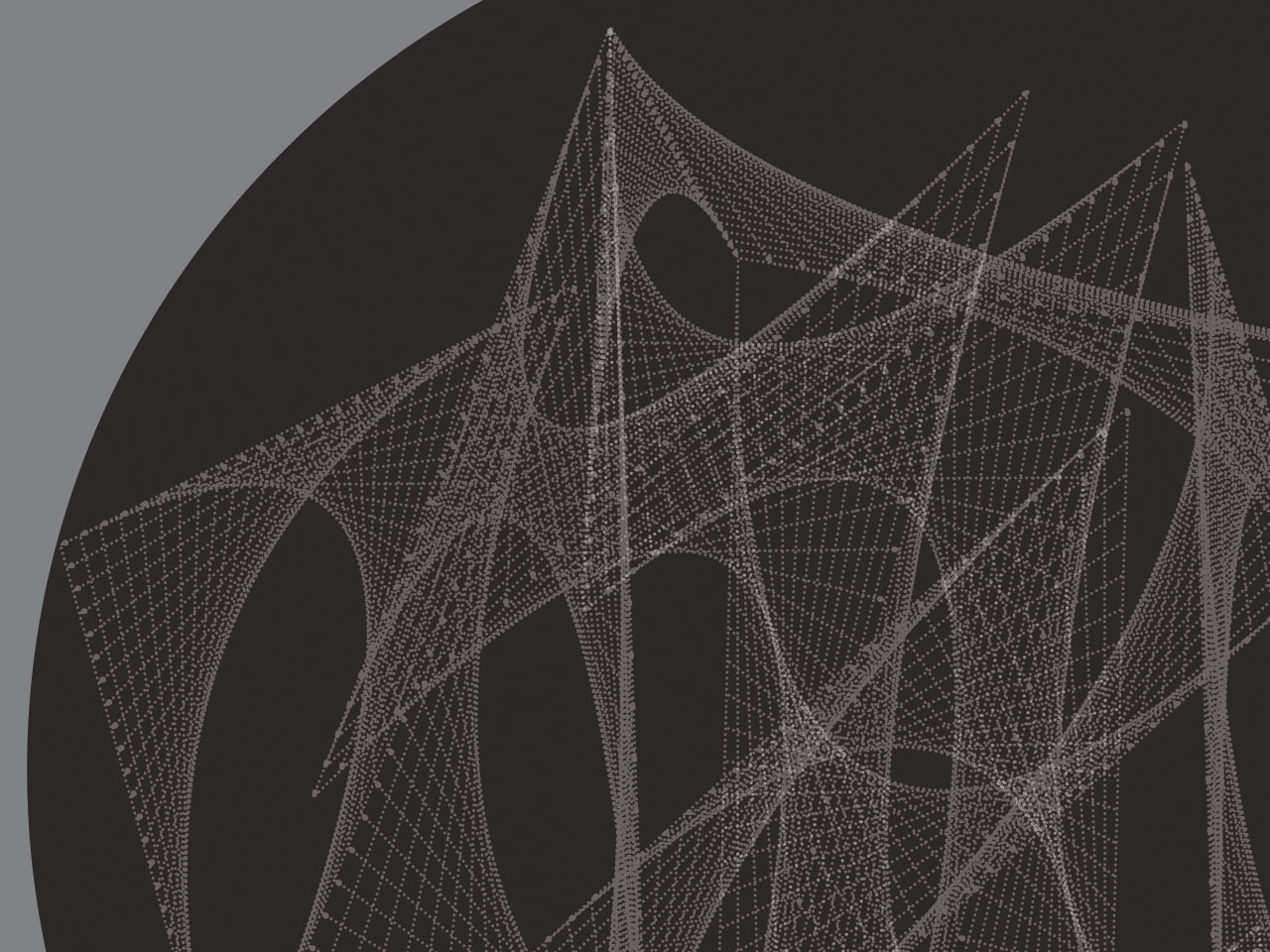 Abstract Theory is a Digital and Vinyl label from Italy and I have also been working with them for a long time. The artwork for this vinyl release was done for one of the label owners, Francesco Bonora. It is based upon a previous artwork I did a long time ago, however he loved the idea so I developed it. It basically consists on creating simple geometric shapes and then interconnecting them by dots that turn them to a kind of spatial meshes.
There’s also symmetry in the figure, as Tânia drew half of it, then duplicated and rotated it to cover the other half. “It’s all connected and yet you can follow every path and line of the artwork. It also looks great when spinning on a turntable and this is also one of the main aspects one has to have in mind when designing a vinyl.”